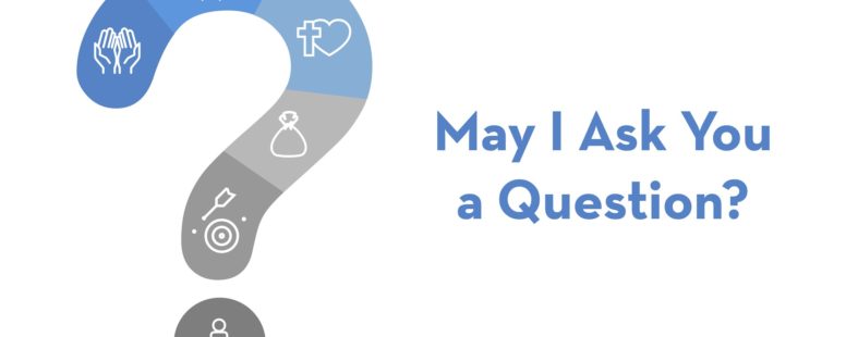
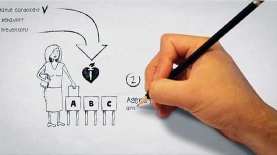
A local church ministry wanted help putting together a simple motion graphic of one of their gospel presentations. This is the result.
If you are logged in, you will see more samples. Please register if you would like greater access to our portfolio, or for a custom demo.
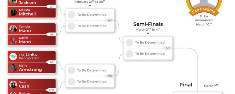
Reclaim Your Rhythm is a recent website for one of our favorite clients. The organization is holding a special voting event on Instagram for Black History Month. The client needed a way to track a fan-favorite event running for the month of February 2022.
While Left Brain Media has been creating captivating media solutions for two decades, we produced an eLearning demo reel you can watch in just two minutes. Let us power your next project.
This is one of the many dozens of websites we have created for this client over the last 16 years. The first page has a counter that estimates the number of patients with AFib in the United States based on published studies.
With this quick project, the client needed a motion graphic to display in an exhibit booth. They gave us a rough, text-only script and a five-day turnaround time. We edited the script, sourced music, mocked up a full storyboard, got approval, and then created the motion graphic.
This current project is for a CEO Roundtable on health in the workplace. The WordPress template is modified to match their other web properties.
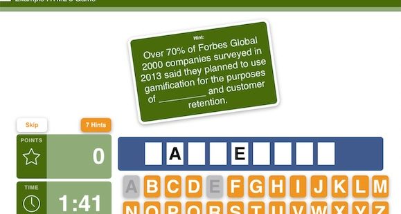
Take a look at this quick example of a responsive eLearning game we developed in HTML5 with Tumult Hype, which works on mobile, tablet, and desktop devices.
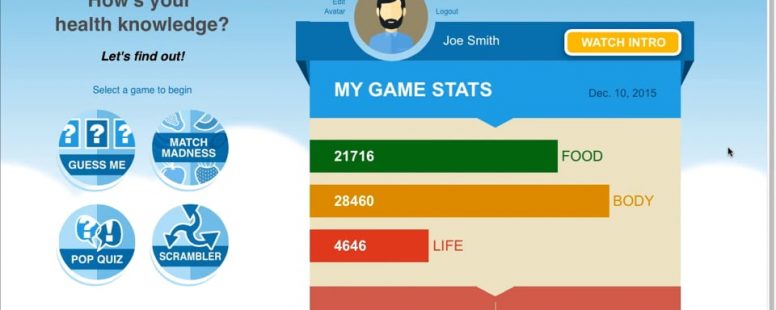
One of our retail chain clients wanted to help its employees gain the knowledge needed to make healthy life choices. The client had a ton of content to cover, but the employees often just had short periods of time to learn the material because of competing demands. It was a great opportunity to leverage gamification.
View a couple of sample black-and-white, whiteboard-style animations.
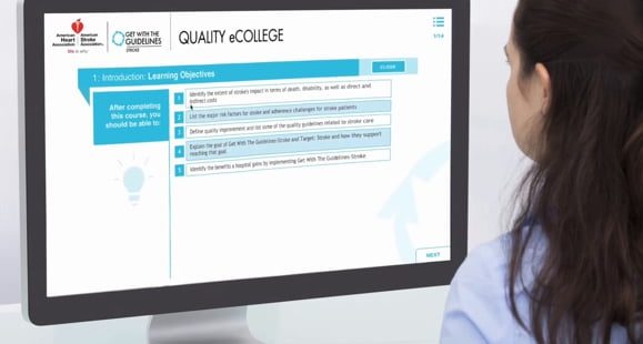
This video is an overview of an eLearning series we created for one of our favorite clients. Designed for both mobile and desktop platforms, these courses feature many hours of custom video interviews and animations.
This promotional video is for the one of our favorite clients, and also the winner of 5 Telly Awards. This video is a good sample of quality created on a relatively limited budget. It used some volunteer actors and required access to facilities and equipment to make things realistic.
